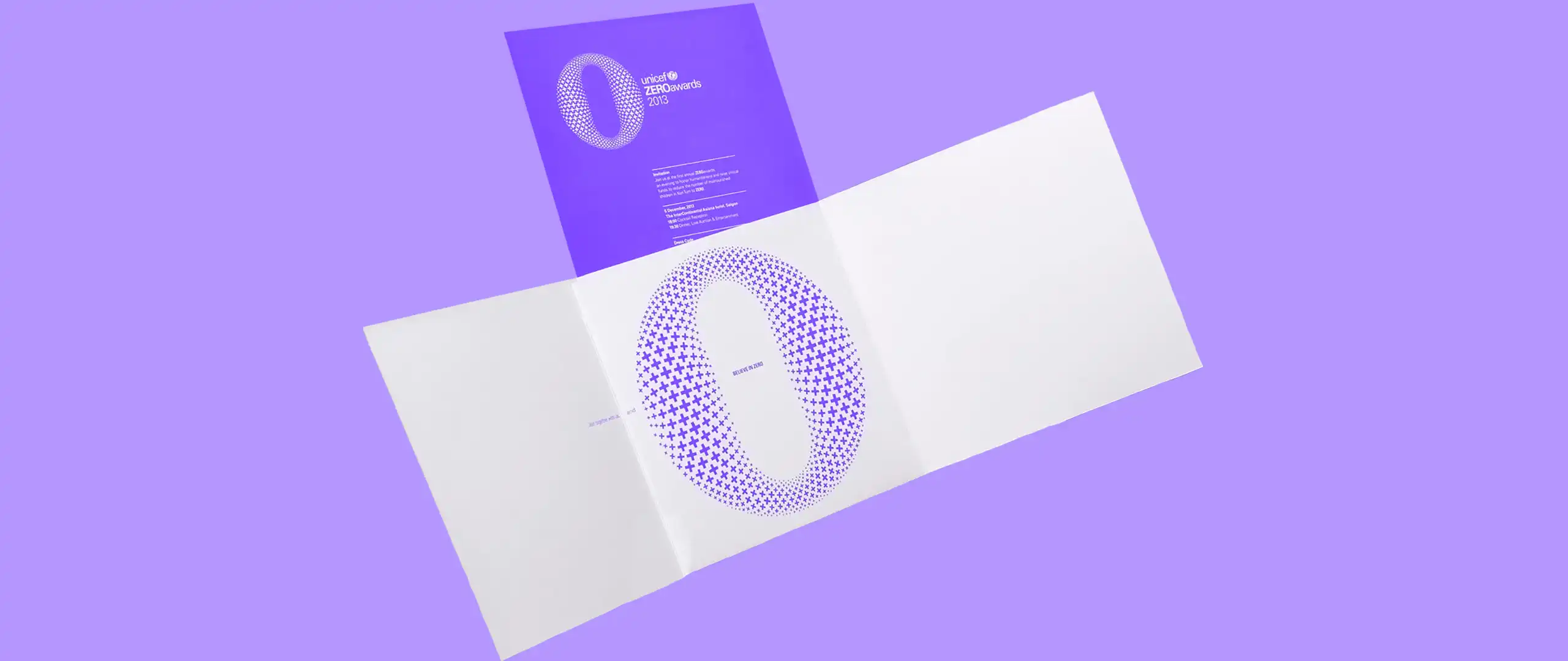
Brochure design ideas for business are a great way to get the attention of potential customers. Besides, it’s a no fuss way to avoid the sharing frenzy and hashtags on social media. Albeit social media is widely used by many marketers, brochures allow you to avoid these saturated platforms.
Nowadays, everyone you see is holding a device in their hands. Particularly, a smartphone or tablet. So, why not help them to hold and look through your beautiful brochure design especially made for business. After all, it’s neatly packed with information about your products or services. Not to mention, it’s very useful in helping customers make informed buying decisions, right?
Well, even though the above may be true, you first have to get customers to pick it up and read it. For this reason, you can’t use the same ole’ design styles. Because like the iPhone 4, the thrill of that brochure design has worn away.
When you create the same tired brochures that all look and feel the same, no one wants to read it. Be different than your competitor and put your marketing budget towards fresh and clever designs.
In this blog post, we’ll discuss 4 ways to enhance your brochure design and ensure your ideas are solid for business.
Let’s get started!
1. Fun Business Brochure Design Ideas
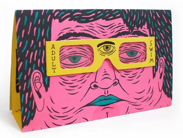
This is one of those awesomely fun business brochure design ideas that the designer thinks outside of the box. Not only does it have a unique illustrative style, but the colors also make it delightful. Even the line work adds a special flare of being youthful and hip.
Additionally, the glasses can actually be removed and worn by the reader. Undoubtedly, this doubles as a great advertising.
2. Complex Brochure Design Ideas For Business
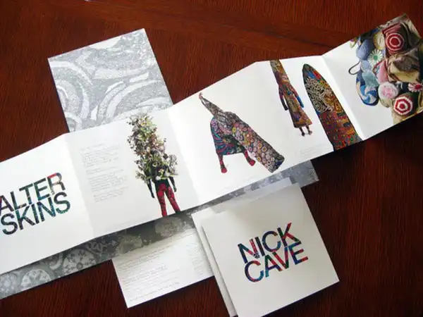
One of the more complex business brochure design ideas that’s also contains more panels than normal brochures. Obviously, this one broke the mould by cranking up the size. In essence, it’s more of an in-depth pamphlet. A unique design that offer readers more opportunities to interact with their brand messaging.
3. Use Geometric Shapes For Impact
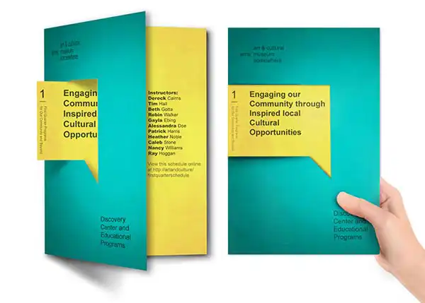
Geometric shapes made into callouts have an amusing effect on brochures. The person who said brochures had to be rectangle also probably thought Amelia Earhart would never be a pilot. You know? She was a woman after all, in the 1800s.
But brochure design ideas for business need not be stuffy. They can and should come in all shapes and size. Even with different folds to accent different features. The die-cut museum brochure above has a tab that sticks out of the side and a gate fold. The cuts also create a cool three-dimensional look, adding yet another element of interest.
4. Be Unique With Die Cuts
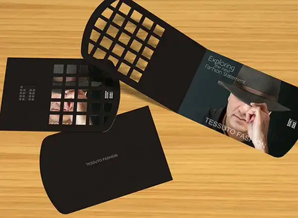
Die cuts can create curiosity and even turn your brochure into a conversation piece. Here, these interesting windows reveal bits of information. The windows resemble a checkerboard and allow the images underneath to show through.
The idea is to show just enough to peak interest so people will open and investigate.

