To stay relevant, you need to stay current with modern design trends, especially if you are a graphic designer. Because when it comes to logo design trends, you could inadvertently create an outdated design for a client.
Obviously, that would be a bad experience for both you and the client. Once a logo has been established, it becomes part of the overall branding experience. Have you ever noticed how people remember certain brands over others?
This is due to how people associate with a product or service. Starbucks, Nike, and McDonald’s are testaments to the power a logo has over a consumer. These logos and products are instantly recognizable.
Logos often reflect how well consumers perceive a brand or business. As such, adhering to modern logo design trends assures your logo can stand the test of time. Some trends are still making waves even in 2022.
Modern Logo Design Trends
If you’re looking for design inspiration, incorporate the following techniques or styles into your logos.
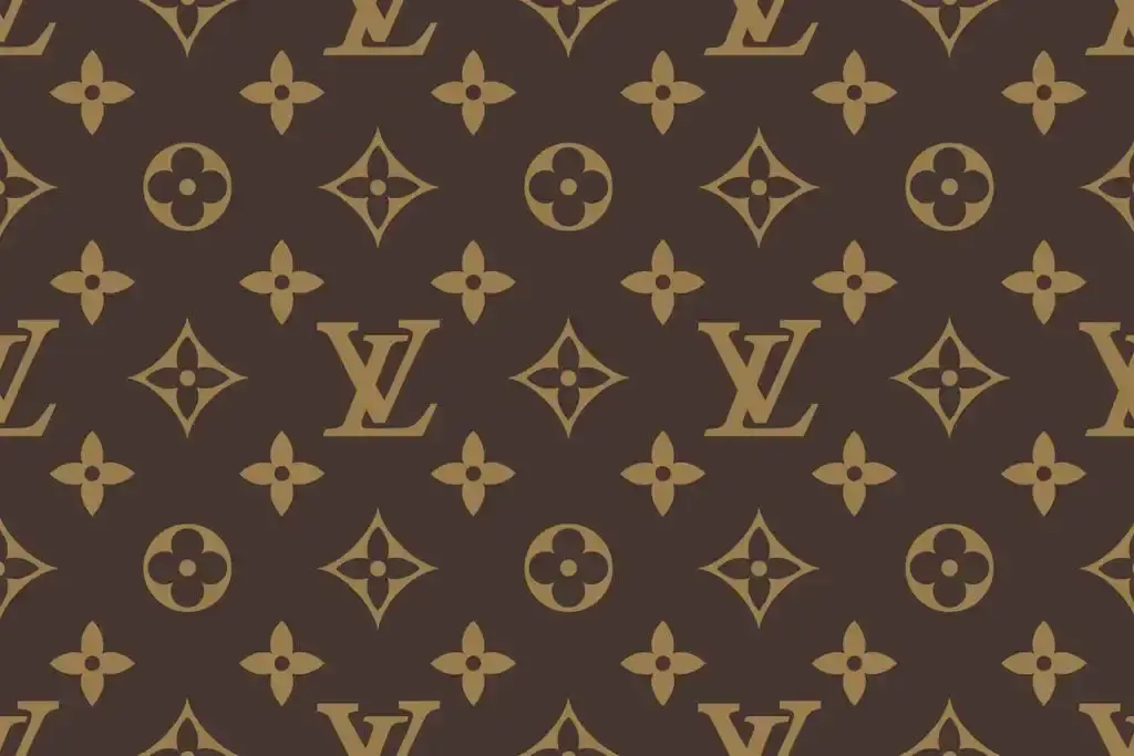
1. Monograms
Albeit a minimal style, it’s timeless and will thoroughly represent your brand. In fact, this monogram has been a favorite since the 19th century. Hence, it is not surprising that monograms are used by many brands, including this luxury one by Louis Vuitton.
2. Gradients
Gradients can be used to make the logo design pop and it adds dimension. In addition, it helps accentuate details as well as render a uniform look. The blending of light and dark hues make the Loog appear like it is embossed or 3D.
3. Geometric Shapes
One of the most popular modern logo design trends is to use geometric shapes. When we say shapes, these are sleek and straightforward elements that are not too overbearing to the viewer. They are simple, so they tend to be easily remembered as is the case with this Google Meet logo.
4. Negative Spaces
From the term space, this trend highlights the use of space to direct attention. Sometimes, space is also used as a means of rendering meanings that can hook viewers.
This mini guide can be helpful to those creating modern logos. In essence, it gives you an idea of different creative directions to take your designs.
You may also enjoy reading: When To Start Decorating For Halloween

